Fine-tune people's experience around personal information
A tool to help you fine-tune a product experience through the lens of personal information.
What is it
This tool will help you streamline people's experience around personal information within a product. It will help you spot grey areas and identify areas to improve the product.
![[Illustration] ExperienceMap Overview](/site/assets/files/9081/_illustration__experiencemap_overview-1.png)
Informing people about their privacy and personal information use can become a real challenge, often relegated to a single, disruptive, notification upon first time use. But there is another way possible, which is to design information and controls as a genuine addition to a product's value proposition.
Designing for personal information can be approached through a more holistic lens, making it a trust vector within the overall experience arc of a product. This blueprint guide should help you here: it will provide an overview of the experience and key moments of interaction with people, as well as helping you to define the content and identify research questions to solve.

![[Illustration] ExperienceMap Overview](/site/assets/files/9081/_illustration__experiencemap_overview-2.1200x600.png)
How to do it
What are the key moments in your app when people are or should be informed about data use, and can or should be able to control how they can use it? What are other key moments within the experience that are directly related to people's personal information and data use?
Once you've identified these moments, map them chronologically into the blueprint's phone casings. Working form the template, describe the interactions and the data needed for each screen.
![[Illustration] ExperienceMap Step 1](/site/assets/files/9081/_illustration__experiencemap_step_1.png)
Now that you know which moments, areas and therefore screens you'd like to work on, start filling in the blueprint row by row. Focus on the red and blue ones first. The blueprint is designed to put you in people's shoes by asking yourself what their concerns might be, what they might be happy or unhappy about, and what might need clarification.
Now that you have a clearer understanding of what works and doesn't work within each screen, take a step back. Look at the overall app flow and ask yourself: what works as a whole? Are there clear pitfalls within the experience? What happens here that should happen there instead? What connections and reminders could be added to make it easier for people?
Finally, fill in the purple rows and draw hypotheses on how to solve for these challenges. Try to bring more clarity as to what people's core needs are at each step. How can we improve each screen? List your ideas and intuitions.
![[Illustration] ExperienceMap Step 2](/site/assets/files/9081/_illustration__experiencemap_step_2.png)
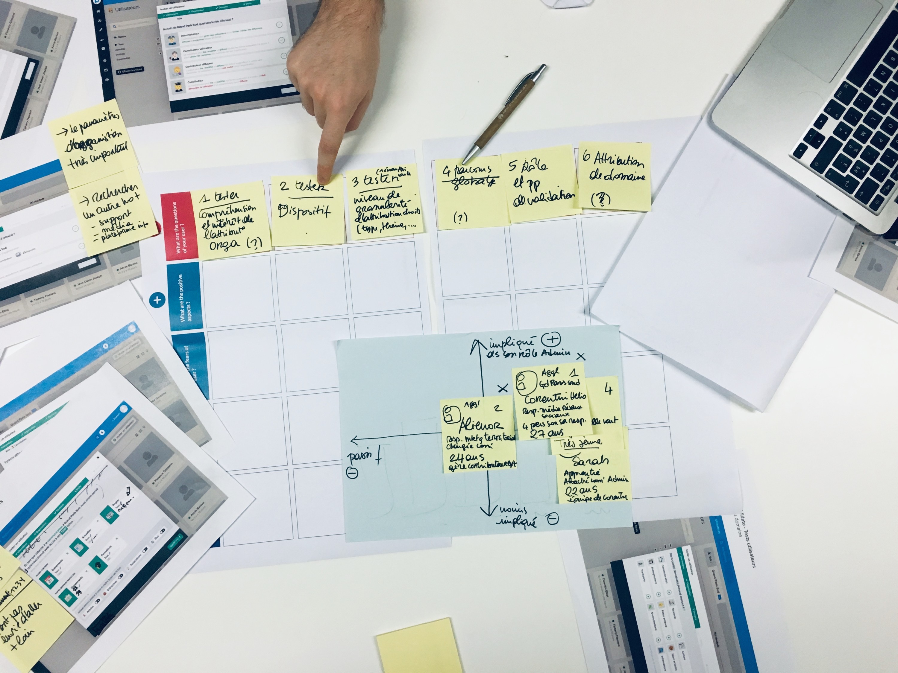
Now you need to test these assumptions to validate or invalidate them. You can do that within your own team or run proper user tests. Our tool can help you to do so.
Once you've gathered feedback, go back to the Data Blueprint to focus on product improvements. Look back at each screen and moment of the tested experience and map out both positive and negative feedback from the user tests as well as the emerging questions, needs and expectations of people. Validate or invalidate the hypotheses you made. Use this document as a map to drive the design iterations that will bring people clarity, answer their needs and meet their demands.
Once a research phase has been completed, it's important to take a step back and take the time to list what you learned. Making sure the knowledge you've built is in a qualitative, shareable format is important to make sure nothing is lost by your team! Use our Synthesis presentation template to gather your learnings into a sharable format.
This presentation template will provide a structure and a visual way to map out what you learned from the UX research or user testing phase and draw improvements from those findings.
Finally, take a step back and document the development of your product from the first prototypes to testing and learning. All that remains is for you to draw up your Implementation roadmap to provide better control as well as strengthen transparency and trust within your app in the coming months.


This tool and any associated downloadable assets are provided under a
Creative Commons Attribution-Share Alike CC BY-SA 4.0 International License.Related content
