Deconstruct transparency
Enable participants to understand the mechanics of transparency by analysing example privacy notices.
What is it
Privacy notices in digital apps and services vary greatly. However, they're not always as clear about their intentions as they could be.
When it comes to building a user's trust, and allowing them to have control over their personal data, it's important that privacy notices are transparent about what they're asking of you: by presenting information clearly, and in an engaging and user-friendly way, so that you understand the value exchange between your personal data and the service provided.
This is achieved through a combination of clear language, a clear hierarchy of information, intuitive interaction design, and engaging visual layout.
This exercise aims to give participants a deeper understanding of what transparency is, and identify what good transparency looks like, by inviting them to analyse a range of examples and rank them on a scale.

How to do it
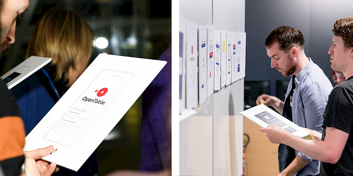
- Download and print the Privacy notices ↓.
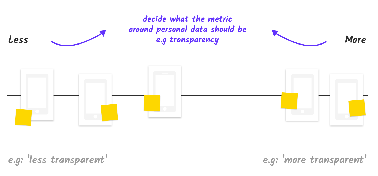
- Find a clean surface (e.g. whiteboard, flipchart) to work on. Write what the task entails at the top, as follows: “Decide what the contributing factors to data transparency should be. Place the example privacy notices on this scale”.
- Draw a horizontal line across the middle. This will act as the scale the participants will use to decide where their examples go. On the left side of the line write “Less” and on the right side “More”.

- Ask the participants to pair up, and then hand out at least one privacy notice example to each pair.
- Explain what the exercise entails, as described in the "Overview" section above.
- Emphasise that it is up to the participants to discuss the main contributing factors to data transparency for their example.
- Each pair should have a discussion about what "transparency" means and where their privacy notice(s) fit on a scale of "less" and "more" transparent, giving the example that there are several contributing factors to transparent communication:
- clear language
- clear hierarchy of information
- succinctness of information
- intuitive interaction design
- a visually engaging layout
- Introduce the scale you created, and tell the participants you will be asking them to place their privacy notice examples on this scale, after they've shared their thoughts on the main contributing factors behind their decision.
Ask each pair to explain the major contributing factors behind their decision with regard to their level of transparency. Prompt them with relevant questions:
- Is it clearly communicating how and why the person's data will be used?
- Is it engaging, both in the way it is written and how it appears visually?
- Is it simple and succinct? Does it make the user feel like they have control?
- And conversely, are there any ways in which it's being confusing or complicated, or not explaining enough?
Once they have considered all these points and articulated their thoughts, instruct them to place their example on the scale.
Ask participants to write on a Post-it note their major contributing factors to provide the reason why they placed their example where they did, and get them to stick the Post-it note on the example.
- Lead an open discussion around the decisions people have made. One by one, select a privacy notice example and ask the owners to read out what their major contributing factors were and the reason why they placed the example where they did.
- Invite them to analyse their choices according to the choices other participants made. Get them to compare each other's decisions. What are the similarities or differences between the various factors and examples? Is there a reason why similar examples have been placed on different parts of the scale? Are the example placed at the extremes of the "more" and "less" scale justified in their position? Depending on group sentiment, move the examples around as needed.
- The aim here is to oepn up discussion based on the contributing factors for "transparent" communication, drawing on some of the difficulties to acheive this in practice. Reflect on the discussions that took place and highlight any key points raised around designing for transparency which will be useful for the design challenge later on.


This tool and any associated downloadable assets are provided under a
Creative Commons Attribution-Share Alike CC BY-SA 4.0 International License.Related content
Preparation 30 mins
Delivery 15 mins
Preparation 15 mins
Delivery 15 mins